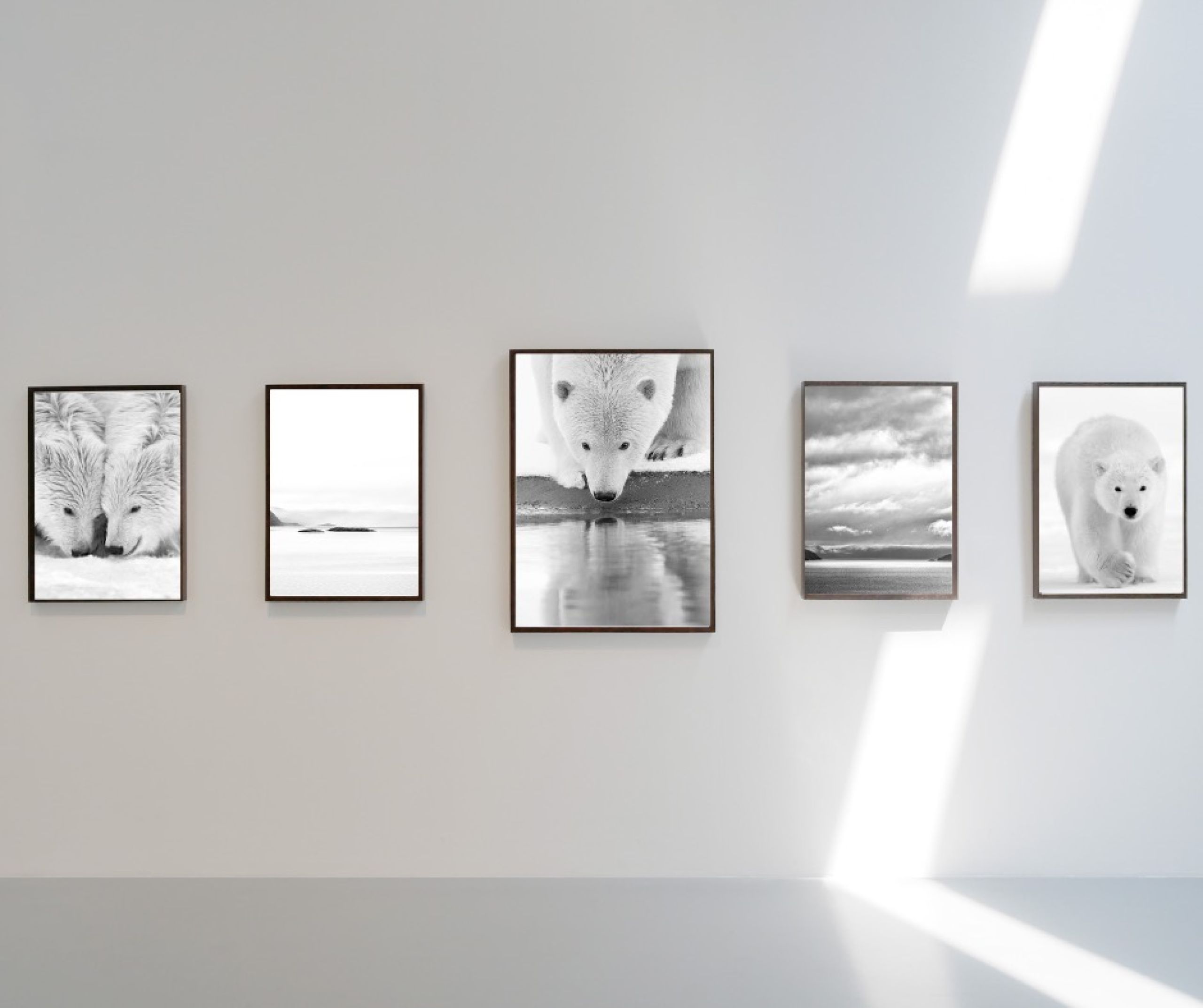
Create a Gallery Wall: Arrange Multiple Fine Art Photographs for Maximum Visual Impact

Photos : © Lionel Maye
Much more than a simple stack of frames, the gallery wall is a wall scenography exercise: it tells a story, sets the pace of the space, and enhances your prints. Whether it’s for a professional exhibition or a home display, a few simple rules will help you turn a coherent series of images into a spectacular ensemble.
Summary
- Define the concept and visual coherence
- Choose the wall and take measurements
- Formats, frames, and print preparation
- Layout methods: grids, lines, salon style…
- Height, spacing, and proportions
- Mounting, lighting, and protection
- Practical installation steps
- FAQ
1. Define the concept and visual coherence
Just like for a professional exhibition scenography, start with editing (photo selection): pick 6 to 15 photographs that share a theme, color palette, or format. Key points to consider:
- Narrative: chronological progression, seasonal variations, or alternation between wide shots and details.
- Palette: all color, all B&W, or complementary harmonies.
- Rhythm: alternate large and small formats to avoid monotony.
2. Choose the wall and take measurements
A free wall at least 1.5 m wide is ideal to let the composition breathe. Measure height, width, power outlets, furniture; take a photo of the space to preview the setup. For a living room or hallway, reserve at least ⅔ of the wall width for the final arrangement to avoid a “post-it” effect.
3. Formats, frames, and print preparation
- Prints: choose the same paper (matte, baryta…) for unity.
- Frames: same color and thickness for a museum look, or an intentional mix & match for an eclectic wall.
- Mats: white 7 cm mats give breathing space and harmonize margins.
4. Layout methods: grids, lines, salon style…
| Layout | Description | Best for |
|---|---|---|
| Regular grid | Strict horizontal & vertical alignments | Homogeneous series (format & theme) – contemporary gallery look |
| Central line | All frames aligned to a central axis | Hallways or above sofas; mixed formats but same center height |
| Salon style | From floor to ceiling, high density | Tall walls, eclectic collections, or rich storytelling |
| Triptych / diptych | 2 or 3 related works, evenly spaced | Panoramic landscapes, conceptual series |
| Organic mosaic | Compose around a central statement piece | Family wall, relaxed dynamism |
5. Height, spacing, and proportions
The museum benchmark
Museums place the center of artworks between 145 and 152 cm from the floor. For a gallery wall, calculate the visual center of the entire composition — then build around that line.
Horizontal & vertical spacing
| Frame size | Recommended spacing |
|---|---|
| Small (< 20×30 cm) | 5 cm (≈ 2 in) |
| Medium (30×40 cm) | 5–8 cm |
| Large (> 50×70 cm) | 8–12 cm |
The key is consistency: keep the same spacing throughout, unless a graphic effect is intended.
6. Mounting, lighting, and protection
- Picture rails: ideal for adjusting and changing layouts without drilling holes.
- Wall anchors suited to weight; double hooks recommended above 3 kg.
- Lighting: 3000 K LED spots, 30–35 ° angle, even light flow; watch out for UV rays.
- Museum glass (anti-glare + UV) for valuable prints.
7. Practical installation steps
- Floor mock-up: lay out your frames on a blanket and take photos of different versions.
- Kraft paper template: trace each frame on paper, tape it to the wall, adjust as needed.
- Marking: mark suspension points (laser level recommended).
- Drill & mount: start with the centerpiece and work outward.
- Final check: adjust with foam pads if needed for alignment.
8. FAQ
How do I center a composition above furniture?
Leave 15 to 25 cm between the top of the furniture (sofa, console) and the bottom of your arrangement to avoid visual compression.
Can I mix photos and graphic art?
Yes; ensure coherence via color palette or a common theme. In a salon style layout, vary media (etching, photo, drawing) while maintaining a shared color anchor.
Is there a tool to calculate spacing?
Free gallery wall calculators exist — enter wall dimensions, frame sizes, and desired spacing; they provide a precise layout plan.
What if I change my prints often?
Choose a picture ledge system or sliding hook rails, which allow hanging without additional holes.
Conclusion
A successful gallery wall is built on three pillars: aesthetic coherence, technical precision, and storytelling. By carefully planning your measurements, visual rhythm, and spacing, you can turn a simple wall into a visual statement that elevates your fine art photography and captivates the eye.


